Stradia
AI travel planning
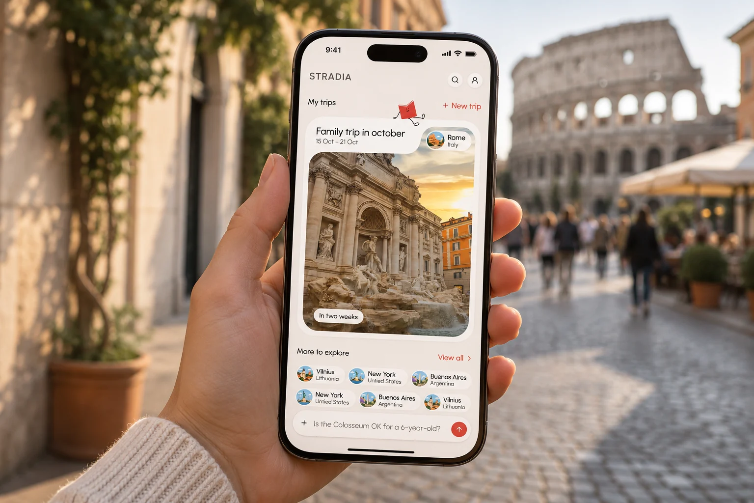
A book-inspired, AI-powered way to discover and experience the world. I took the client from choosing a visual direction to a UI concept: a modern, clean app with expressive shapes and a little guide called Stradi.
The product
Stradia is a travel app built on real knowledge. Its AI isn’t just guessing: it’s fed actual books about each city, so every suggestion comes with the history and stories behind the place.
Travellers can create their own AI-based tours, or follow tours that experts created for them, and turn them into trips, days and stops on a map.
My part
Before designing any screens, I prepared a presentation so the client could choose a visual direction. A second presentation turned that choice into a UI concept, with the first key screens.
Choosing a feel
Before any screens, I showed the client two directions for how Stradia could feel.
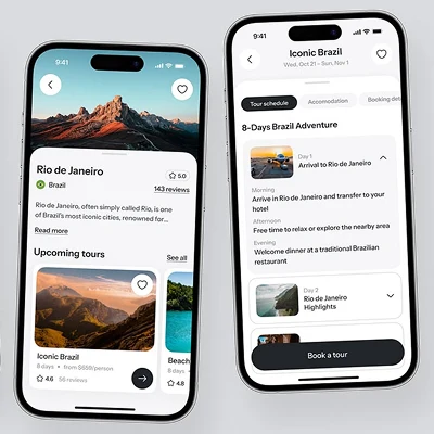
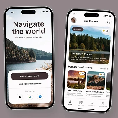
Clarity, strong hierarchy and soft corners, letting the content take center stage.
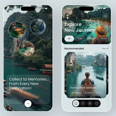
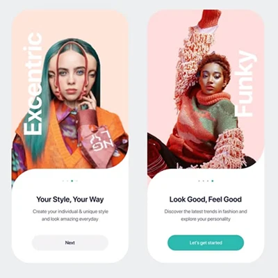
Experimental shapes, bolder curves and unexpected details, still clear and usable.
The client wanted Stradia modern and clean, but also different, fun and expressive. So the concept became a bit of both.
Expressive shapes, modern interface
The UI uses expressive shapes to create personality and movement, while the overall system stays clean, modern and easy to use.
From concept to screens
The shapes and Stradi, applied to the app’s main screens.

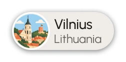
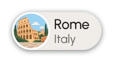
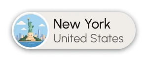

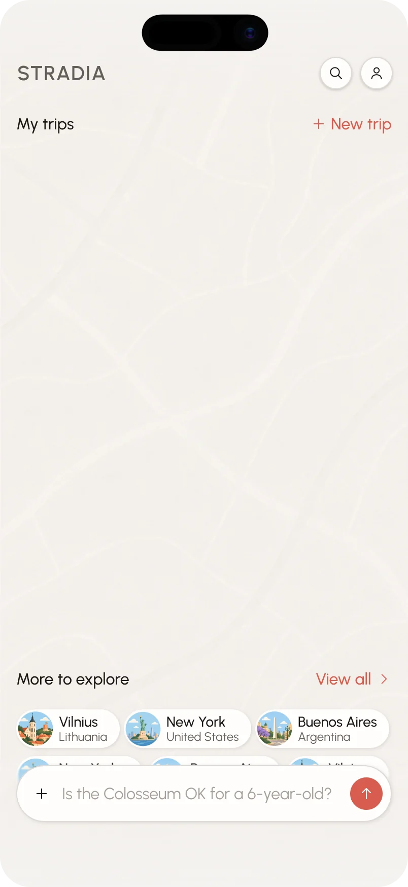
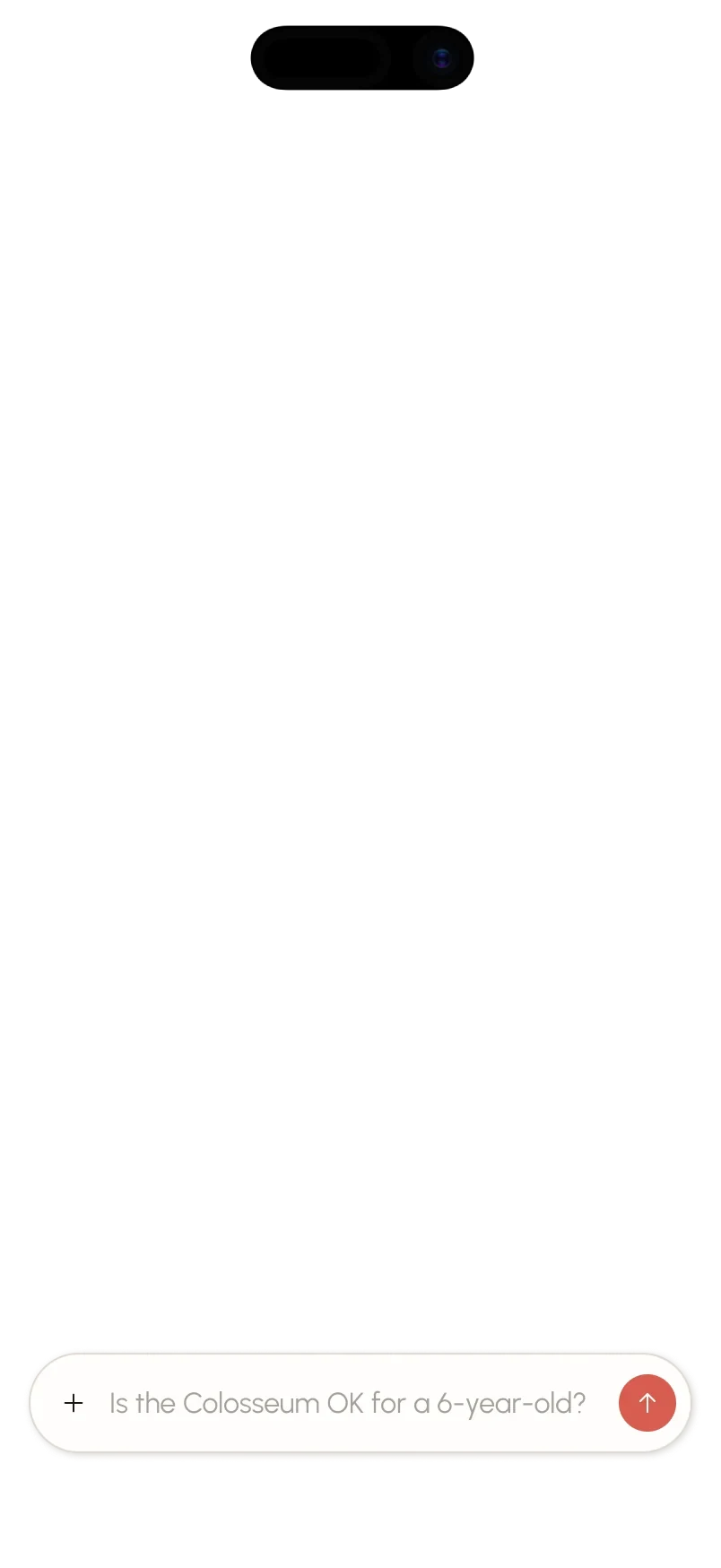
Before there are any trips, the home is a slowly turning globe and the chat. The prompt writes itself with ideas the user might like, so it’s clear what to ask.
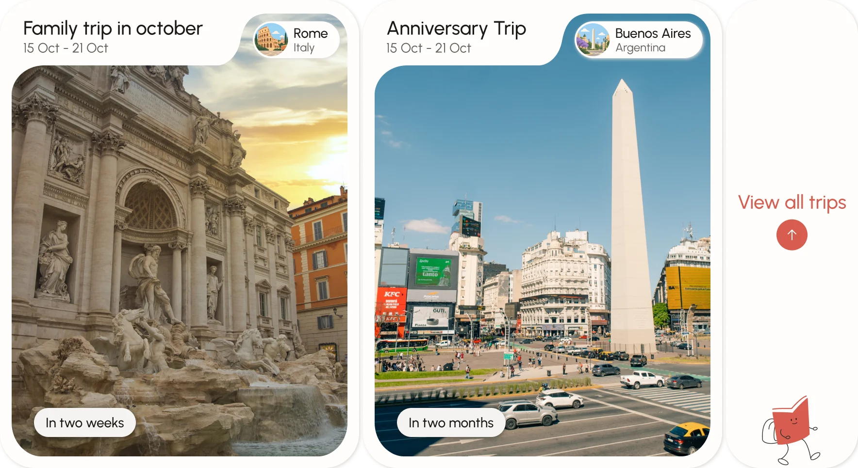
Once the user has created trips, they show up as cards to swipe through.
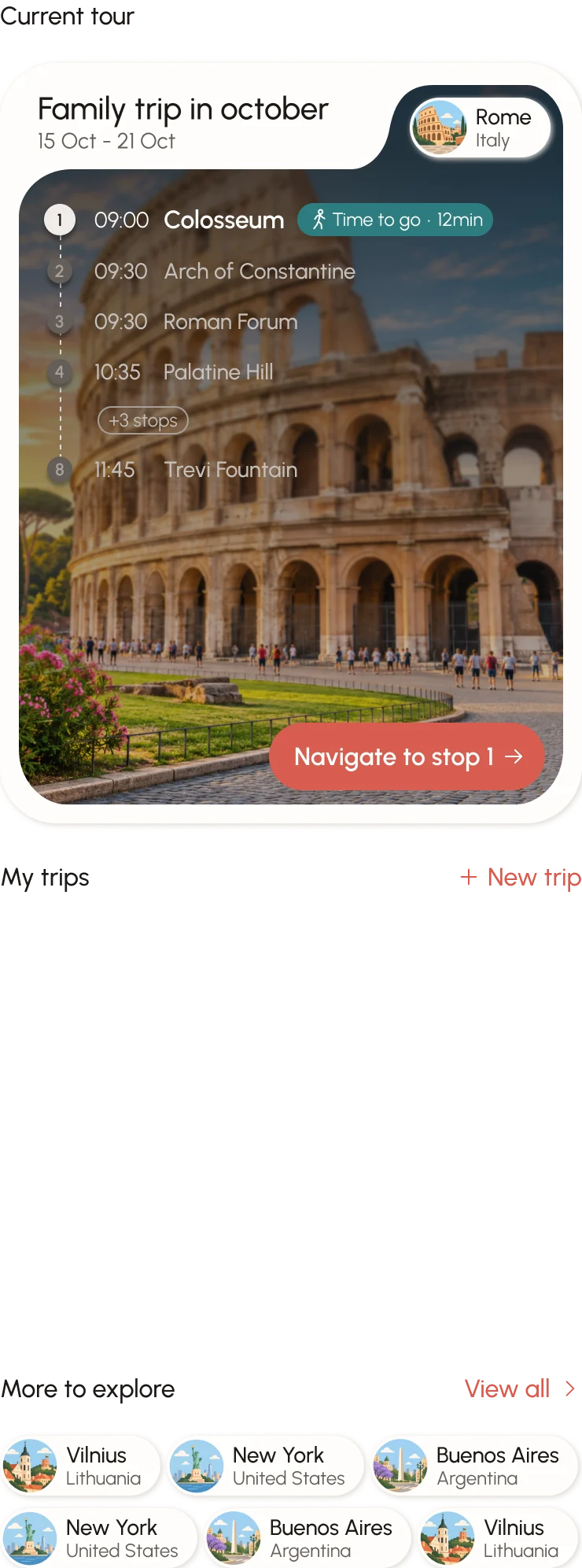
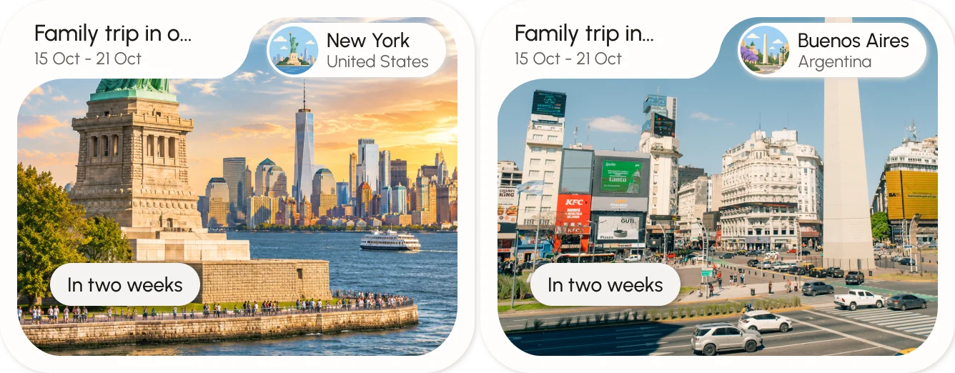

When there’s an active tour, it takes the top of the home, with the day’s stops and a button to navigate to the next one. Future trips stay right below.
Design system
The building blocks behind every screen: color, type and icons, set up as a library so the app stays consistent as it grows.
Two layers: primitives hold the raw palette, semantic tokens describe how each color is used. Terracotta leads, with warm greys for everything else and a few accents saved for maps and illustrations.
ABCDEFGHIJKLMNOPQRSTUVWXYZ
abcdefghijklmnopqrstuvwxyz
0123456789 · ! ? & @ →
Help me plan a trip to Vilnius
One typeface, Urbanist, in three weights, and a small set of text styles from titles down to tiny labels.
Outlined 1px-stroke icons with rounded caps and joins, straight lines and closed shapes, in 20, 16 and 10 px.
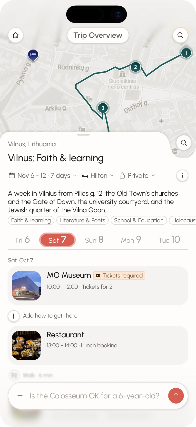





Picking how to get from one stop to the next: each option gets its icon, and the chosen one takes the brand color.
Still in the making
Stradia is still in design, and there’s more coming.
Still in design. The MVP will launch with Vilnius.
Android and desktop versions.
A lot. Working with Claude to speed up the process, and making simple animations with Figma’s AI agents.