Pre/Dicta
AI Litigation Analytics
Pre/Dicta predicts the odds of winning a legal motion. I designed two features that turn heavy legal data into decisions lawyers can act on: an interactive Previous Events Timeline and Pre/dictAI, an AI assistant built into the product.
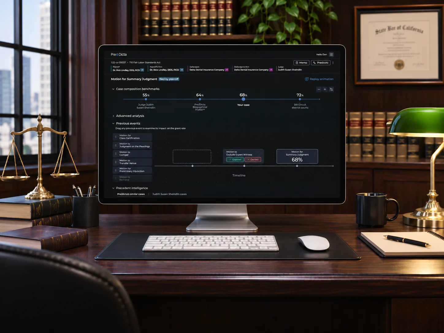
The product
Pre/Dicta is a legal AI platform that predicts how a federal judge is likely to rule on a motion, and how long the decision will take. Instead of looking only at case law, it profiles the judge, the parties and the law firms, and benchmarks the judge against similar "doppelganger" judges.
Litigators and in-house legal teams use it to plan strategy: which motions to file, where to file them, and how to explain the odds to their clients. Every number on screen can shape a decision worth a lot of money, so clarity and trust matter.
My part
I joined an existing product with an established UI. I owned two features end to end, from understanding the problem to the final interactions: the Previous Events Timeline and Pre/dictAI, the AI assistant.
Previous Events Timeline
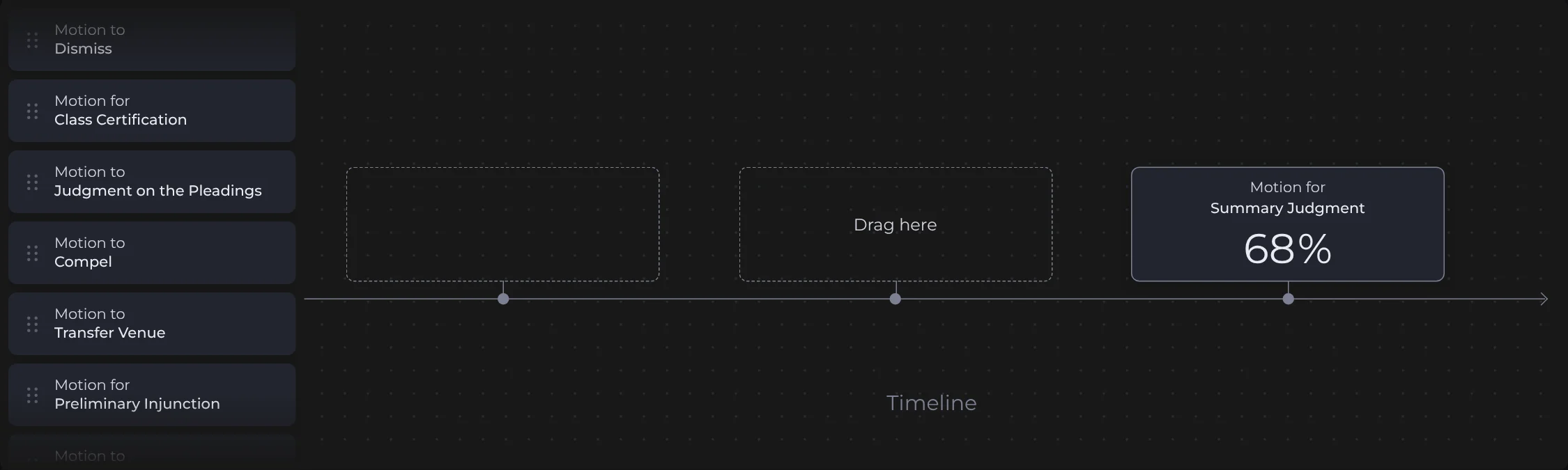
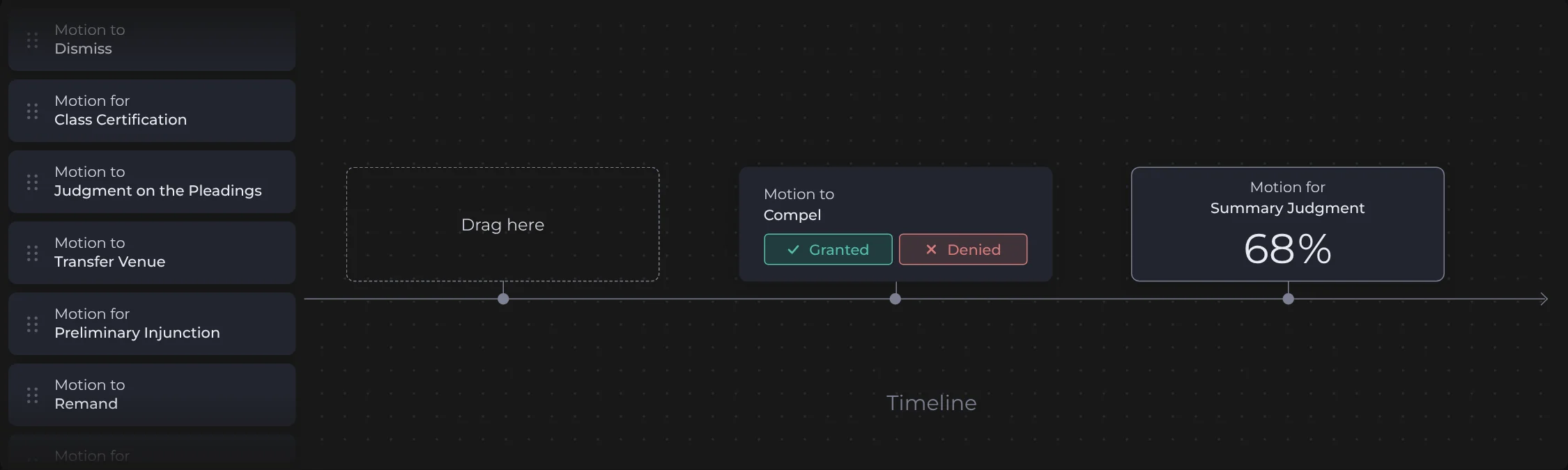
Drag a past motion onto the timeline and watch the odds of your current motion update in real time.
live demo: try it, drag a motion onto the timeline
Previous events
Drag any previous event to examine its impact on the grant rate
Live recreation of the Previous Events Timeline I designed for Pre/Dicta. Grant rates here are illustrative, not real predictions.
From sketch to screen
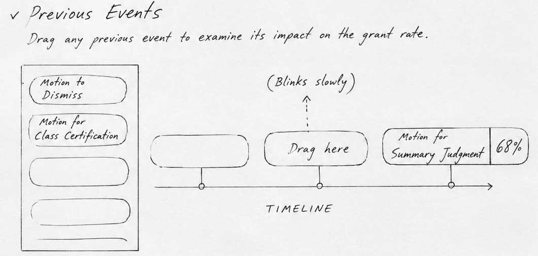
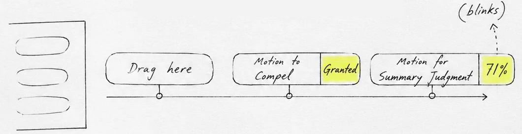
Before any pixels, I sketched the whole interaction on paper. Most of those ideas made it into the final product.
Sketches redrawn from my original paper notes.
Key decisions
01
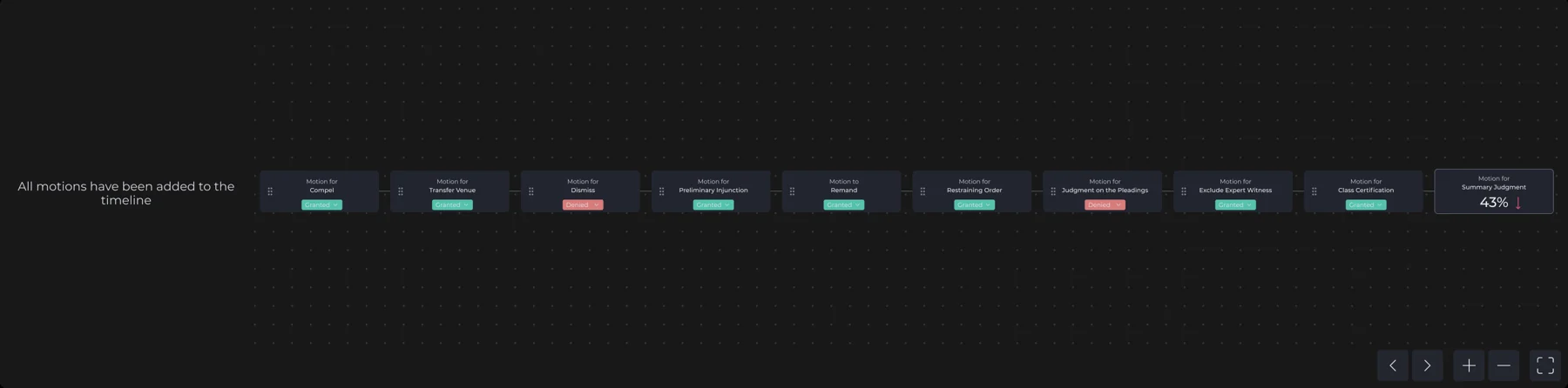
An open canvas, then two slots
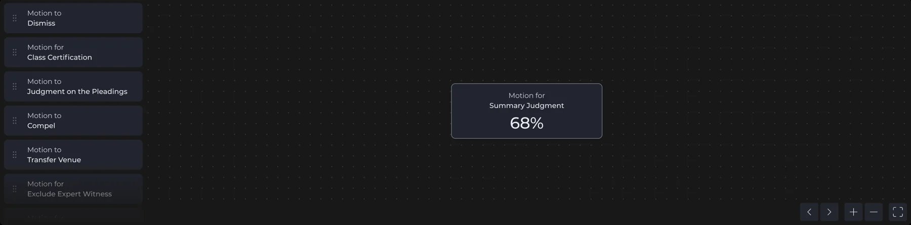
Our first direction was an open canvas: drag in as many motions as you like, then zoom and pan around them. It quickly became confusing, and it didn't match reality, since lawyers usually don't file every motion. So we limited the timeline to up to two previous events, with empty slots that show exactly where the next one goes.
02
Animation instead of instructions
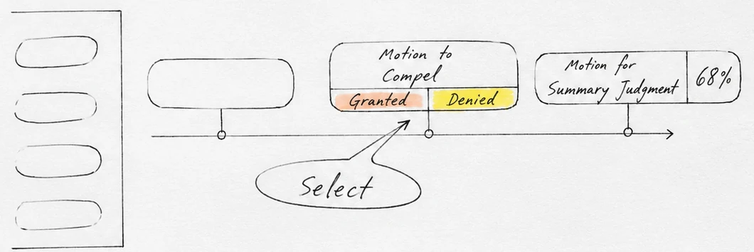
At first we planned on-screen messages to explain how to drag a motion and choose its outcome. Instead, motion does the explaining: a breathing slot invites the drag, and buttons that take turns lighting up invite the choice. The screen stays clean.
03
Where the choice and the result live
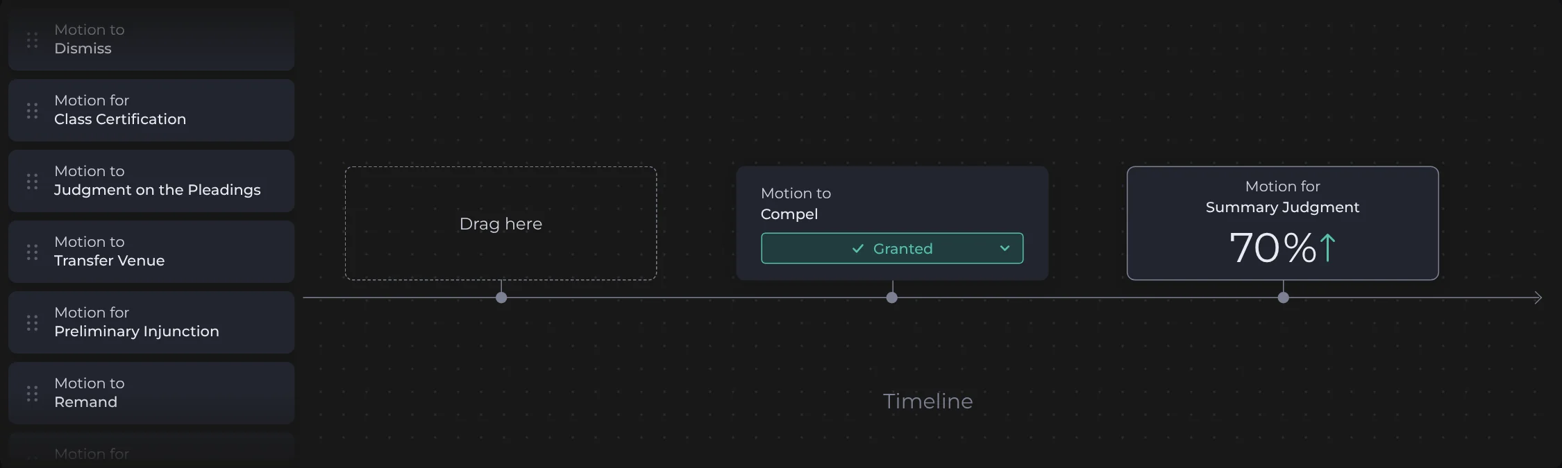
We tried different positions for the Granted / Denied buttons and for the result. Keeping the choice on the dropped motion and the result on the main card puts cause and effect side by side, on the same timeline, so the impact is easy to follow.
04
Higher or lower, at a glance
A new number alone doesn't tell you if it's good news. We explored ways to show direction and landed on the rate counting to its new value, with a green ↑ or red ↓ arrow. Hovering the card shows the original rate for reference.
Pre/dictAI
An AI assistant that works inside the product. Lawyers ask in plain language, the answer appears where it makes the most sense, and anything worth keeping goes straight into a memo for the client.
Motions
plaintiff63%grant ratefiled by
defendant63%grant rate
Appeals
UX · Planning the AI behaviour
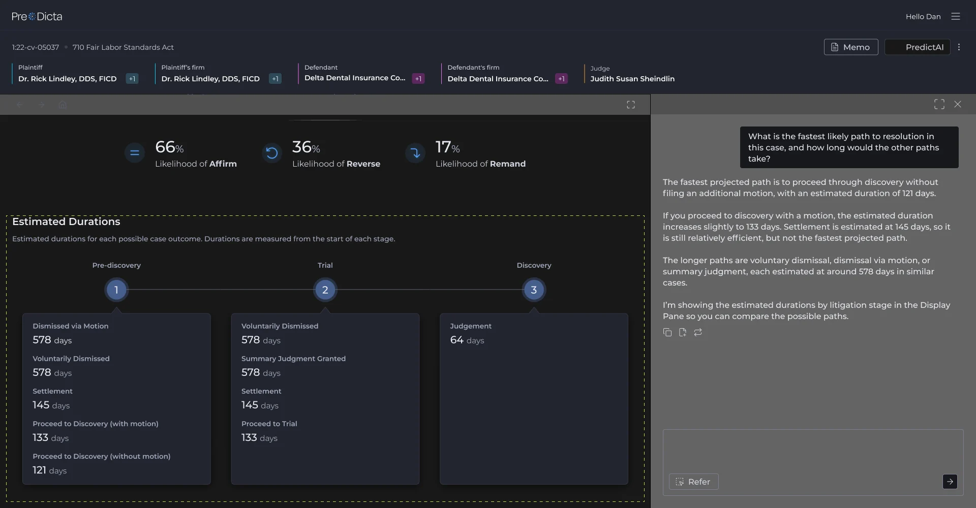
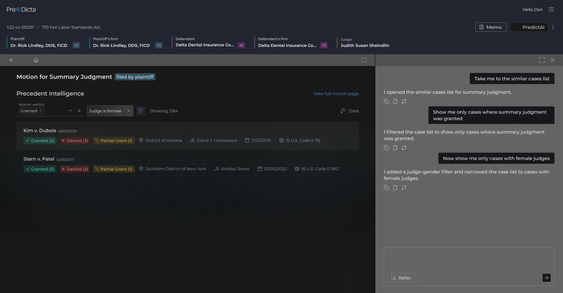
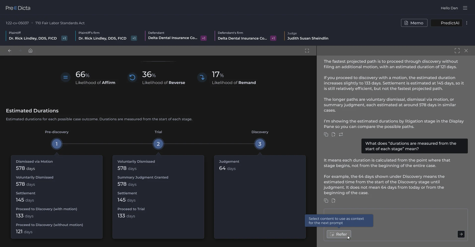
Before any wireframes, I wrote a concept document describing how the assistant should behave across the product. Once the client approved it, I moved into wireframing. These are a few of the flows.
When a lawyer asks something like “What is the fastest likely path to resolution?”, the answer comes back in the chat and the Display pane scrolls to the Estimated Durations section and highlights it. The chat explains, the page shows where it comes from, so lawyers can check the numbers without leaving the conversation.
The similar cases list only has a few built-in filters. Through the chat, lawyers can go further: first only cases where summary judgment was granted, then only cases with female judges. The AI adds each one as a chip on the list, so it stays visible and can be removed like any other filter.
Refer lets lawyers point at something instead of describing it. They select any part of the Display pane, like the note that durations are measured from the start of each stage, and it’s added to the chat as context for the next question.
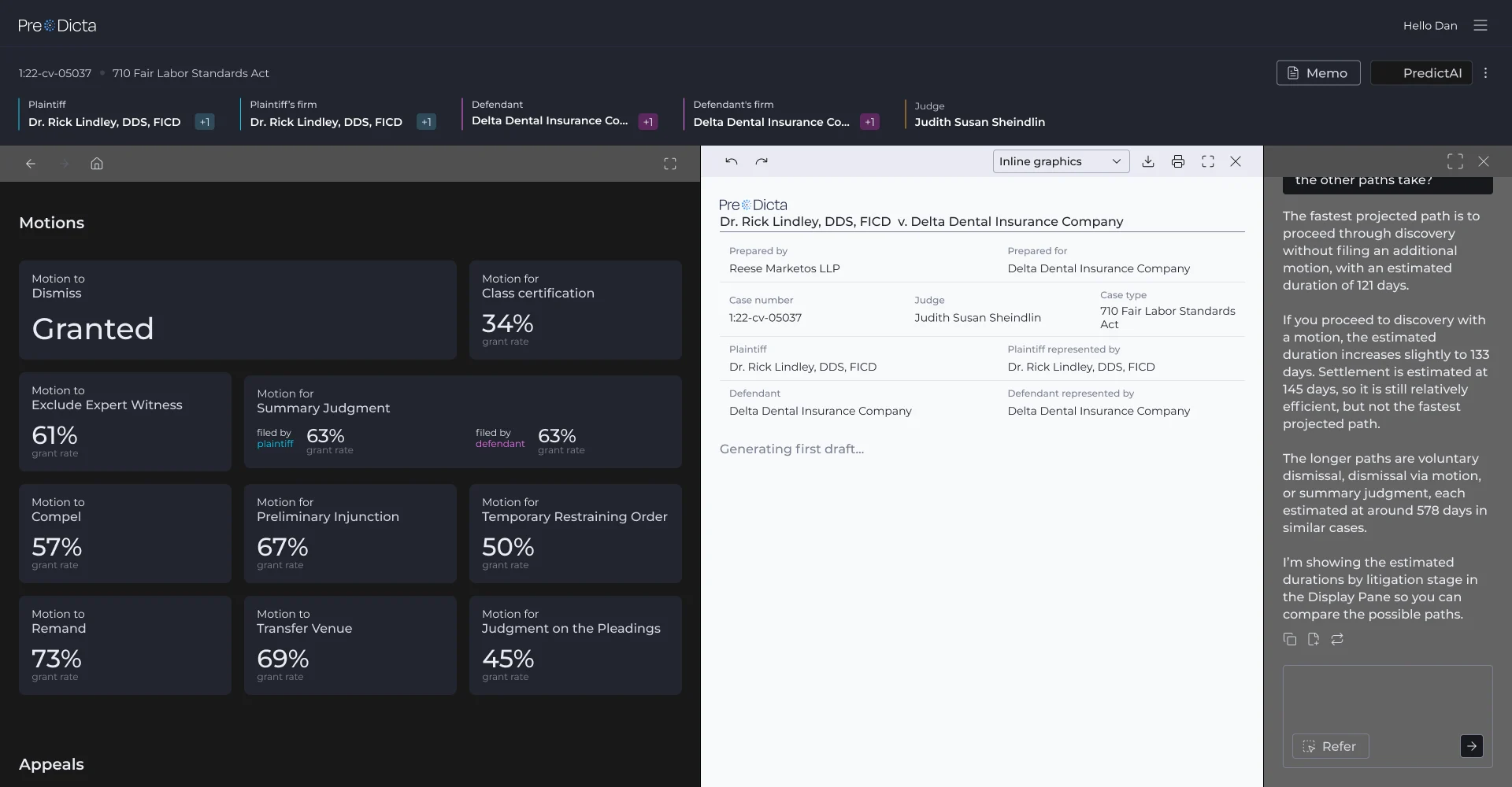
The memo opens as its own pane between the case page and the chat, already filled with the case details, and the AI starts writing a first draft. The chat stays open next to it for follow-up questions while the draft comes together.
UI · From wireframes to the real thing
With the behaviour approved, the next step was making the assistant feel like it had always been part of Pre/Dicta: the same dark, data-heavy interface, with an AI that stands out just enough to be found, but never competes with the data.
Motions
plaintiff63%grant ratefiled by
defendant63%grant rate
Appeals
Its border slowly shifts between blues, so it’s easy to find without shouting over the data. Once the chat is open, it turns into a regular button.
plaintiff63%grant ratefiled by
defendant63%grant rate
When the AI points at something on the page, it gets a soft blue glow that pulses a few times and fades away, so the eye finds it without leaving a permanent mark on the data.
Any section can be sent to the memo, as text or as graphics. When the memo pane is closed there’s nothing else to show it was added, so the item flies up to the Memo button and its icon turns into a check.
For the developers, I mapped how Display, Memo and Chat share the screen down to 1280px. Each pane has a minimum width, with a frame for what happens when each one reaches it.
Designed, handed off, shipped
A year on Pre/Dicta, and all of it is live in the product today.
flows designed across the whole Pre/Dicta platform, not just these two features
component families in the design system, from buttons and tables to charts and case cards
color tokens: 50 primitives and about 50 semantic tokens on top
handovers to the developers in a year of back and forth, with motion specs and responsive rules
“They are some of the brightest and most efficient teammates we collaborate with.”Dan Rabinowitz, CEO of Pre/Dicta, on the 5IVE team